Micro-Branding: Look Pro Online (Without paying a Designer)

At 6:12 a.m., a DM blinked onto my screen:
“Hey Shannon, can you make my page look professional by tomorrow? I don’t have a logo yet. Or colors. Or… anything.”
Coffee in hand, I smiled. I’ve heard this so many times. What she really meant was, “Can my business look calm and trustworthy—fast?”
So I opened the same thing I reach for with almost every client: my Ultimate Brand Building Guided Workbook. Not to pitch her anything—just to give us a friendly path. It’s my “let’s-not-overthink-this” buddy.

The feeling came first
Before we touched a single color, we talked about feeling.
“What do you want people to sense in the first three seconds?” I asked.
She said: calm, cared for, confident.
We wrote one line on the workbook’s first page and circled it:
“Friendly pro—simple steps, calm confidence, zero fluff.”
That sentence became our north star. Every choice had to match it.
A tiny kit, not a giant manual
We didn’t build a 30-page brand guide. We built something human: a mini kit she could use today.
- A few colors that looked good and stayed readable.
- Two fonts (one for headlines, one for everything else).
- Three logo versions that actually shrink well.
- A simple photo vibe: bright light, soft shadows, a little breathing room.
We jotted it all in the workbook so the decisions wouldn’t wander later. No fancy terms. Just, “This is us.”
Templates that feel like autopilot
Next, we picked a handful of reusable layouts—tip card, before/after, short tutorial, testimonial, offer, reel cover, pin. The workbook has a quick map for these, so it took minutes. After that, it was rinse-and-repeat. Swap text and photos, keep the look. Done.
A week that felt different
We didn’t launch with a big “ta-da.” We just… started.
- A promise post about who she helps and how.
- A tiny tip her customers could use the same day.
- A three-slide tutorial that answered a common question.
- A simple before/after (same light, same angle).
- A face + kind words from a happy client.
- A gentle “how to order” post.
- A personal note about why she bakes on quiet mornings.
The grid stopped shouting and started breathing. Every post looked like family—different voices, same last name.
What actually changed
She didn’t “blow up.” She got better DMs. The right people showed up—folks who like calm, clear, dependable. Prices felt easier to talk about. Writing captions took less time. She sounded like herself.
That’s micro-branding. Not a makeover—just a steadying of the room.
The tiny habit that keeps it tidy
Right before publishing, we did a 15-second check (there’s a little page for this in the workbook):
- Are we using our colors and the two fonts?
- Does the logo sit where it usually sits?
- Hook up top? One simple next step?
- Alt text written? Filename saved like we’ll search for it later?
It’s amazing how much stress that one pass removes.
Try this when you’ve got twenty minutes
- Write your one-line “this is how we show up” sentence.
- Pick 3–5 colors you can read at small sizes.
- Choose two fonts and make peace with them.
- Save three logo versions (primary, stacked, tiny mark).
- Decide on a few templates you’ll reuse all month.
If you like having it all in one cozy place, the Ultimate Brand Building Guided Workbook holds these exact prompts and checklists. It keeps the process kind and simple—like a conversation with a friend who’s good at this.
Pair your look with a rhythm
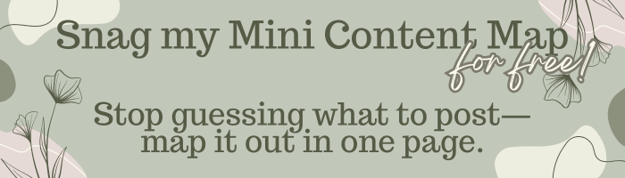
Once your look is steady, planning gets so much lighter. I use my Content Calendar (+ Bonus Content Bucket Sheet) to map a month in a day, then drop posts into those same templates. Consistent feel + consistent rhythm = quiet, compounding growth.
No rush, no pressure. When you’re ready, peek at the resources. For now, sip your coffee and pick that one sentence. The rest gets easier from there.